How to make responsive grid classes with Sass
In this relatively short article, we will make responsive grid classes with the CSS preprocessor SASS / SCSS. We will learn about the display: grid CSS rule, two different kinds of loops in Sass, and the [attr*=foo] selector in CSS.
So let us get started.
¶The Program
We already covered some concepts in this Article where we made padding and margin classes. The grids we make will be barebones; we make them so there is just a range of column counts to choose from, each column having the same width.
So we start by defining a variable that contains a list of integers representing the possible column counts. We have 2, 3, 4, but you could add more if you want to.
$columnCounts: 2, 3, 4
After that, we start to loop over the columnCounts variable. Looping is somewhat similar to how we do it in blade, the template language from laravel.
@each $count in $columnCounts
In the loop, we once again define a variable that holds the string of the value grid-template-columns. We set it to 1fr because each grid can not have just one column. The fr unit is practical when working with grids because it solves the problem of wrapping columns when you set a gap.
$text: "1fr "
After that, we start another loop where we take the $count and add 1fr to the text, like doing for i in range(count) in python.
    @for $i from 1 to $count
        $text: $text + "1fr "
Now we can finally make some classes. We insert the count variable into the class name and the unquoted text into the value of the grid-template-columns property.
	.grid-#{$count}
        grid-template-columns: unquote($text)
We finished with the loop, but the compiled CSS won’t work because we haven’t set the grid classes to display: grid. We can do this pretty quickly with the code below. This unique selector will get all elements where the class attributes value contains the word grid.
[class*="grid"]
    display: grid
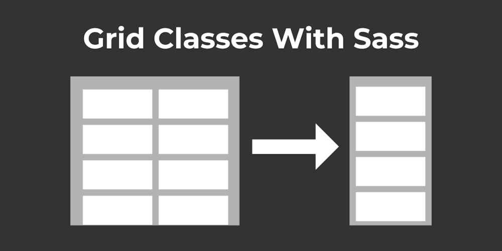
Now to the responsive part of this. We can do this by adding the @media queries indented below this selector. So, if the window is smaller than 900px, we set the grid columns to 1fr, which will make each item full width.
    @media screen and (max-width: 900px)
        grid-template-columns: 1fr
¶Conclusion
Excellent! You have successfully created responsive grid classes with the CSS preprocessor language Sass.
¶Full Code
$columnCounts: 2, 3, 4

@each $count in $columnCounts
    $text: "1fr "

    @for $i from 1 to $count
        $text: $text + "1fr "

    .grid-#{$count}
        grid-template-columns: unquote($text)


[class*="grid"]
    display: grid

    @media screen and (max-width: 900px)
        grid-template-columns: 1fr


Leave a Reply