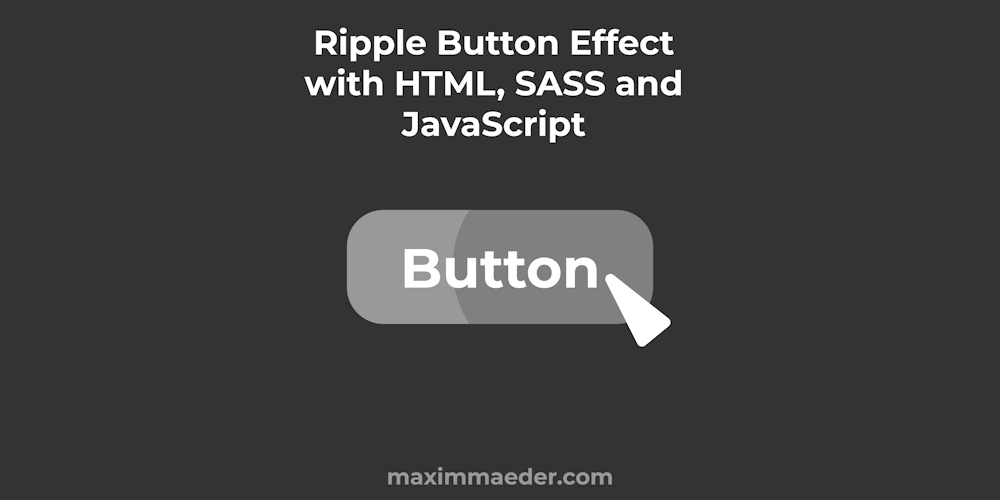
Ripple Button with HTML, SASS, and JavaScript
In this Tutorial, we will make a button component usable in HTML that will show a little splash when clicking on it. We will learn about CSS Keyframe Animations and JavaScript. We will make it so we can simply add a class to a button in order for it to work. We will also make variations of the button for colors and sizes.
¶Sass
Let’s start with the Sass / CSS of the button. We first define some colors. In the first list, we have values and in the second one we have the corresponding names, so these lists must have the same amount of items. The last variables combine them both. With zip() we can merge two or more lists so the items with the same index are placed in a nested list together. We do this so we can access the values and names at the same time when looping.
$color-values:  rgb(234, 95, 95), rgb(95, 211, 234), rgb(234, 162, 95), rgb(95, 234, 165), rgb(95, 95, 95), rgb(0, 0, 0), rgb(255, 255, 255)
$color-names:   'red', 'blue', 'orange', 'green', 'grey', 'black', 'white'
$colors: zip($color-values, $color-names)
We do the same things for the possible sizes. The numbers indicate %.
$size-values: 70, 100, 130
$size-names: small, normal, large
$sizes: zip($size-values, $size-names)
Lastly, we define a ripple size variable because depending on the size the ripple should be larger.
$rippleSize: 8px
Now we select all elements that have the substring button in their class attribute. It is important that we set its position to relative so we can later place child elements with high precision. We also use the text-transform property to transform the letters to uppercase. The other styles are pretty similar.
[class*='button']
    padding: 0.5em 1em
    background-color: rgb(240, 240, 240)
    /* border: 0.5px solid rgb(185, 185, 185) */
    border: none
    border-radius: 5px
    position: relative
    text-transform: uppercase

    font-family: 'Segoe UI', sans-serif
Now for elements with the ripple-button class. we set overflow to hidden so we don’t see the splash outside of the bounds of the button. We also add a hover effect.
.ripple-button
    overflow: hidden


.ripple-button:hover
    cursor: pointer
The ripple effect will be caused by a round span element inside the button that grows over time. We set the position to absolute so we can specify top and left Then we also insert the ripple size variable for the width and height. We also set the border radius to a high number so the element will be a circle. We also disable all pointer-events with the pointer-events property. This will make the span transparent for the mouse. Last but not least we give the ripple an animation and an animation duration.
.ripple
    position: absolute
    background-color: rgba(200, 200, 200, 0.322)
    width: $rippleSize
    height: $rippleSize
    border-radius: 999px
    pointer-events: none
    animation-name: ripple-grow
    animation-duration: 0.7s
The animation is defined below with @keyframes. Here we can specify at what time in the animation certain styles apply. If the ripple element is created it will play this animation, going from scale 0 to 15 so it will grow centered. We also animate the opacity. After 60% of the animation, we go back and fade out.
@keyframes ripple-grow
    0%
        transform: scale(0)
        opacity: 0

    60%
        transform: scale(15)
        opacity: 1

    100%
        opacity: 0
        transform: scale(15)
That is for the SASS / CSS of the Ripple Button, but we also make some variations with the colors and sizes we have specified at the top of the script.
First, we loop over the colors while unpacking/destructuring the values. So we simply make classes like button-blue, with a blue background. We also set the background color of the ripple to be a transparent version of the given color, we do this with fade-out()
@each $value, $name in $colors
    .button-#{$name}
        background-color: $value

        .ripple
            background-color: fade-out(darken($value, 10), 0.5)
Then we also make some classes for the sizes in a similar way, but we use the unquote function to remove the quotes from the value because have combined it with a percent %. We also calculate how large the ripple should be at this size and reinsert these values.
@each $value, $name in $sizes
    .button-#{$name}
        font-size: unquote($value + '%')

        $multiplier: ($value / 100)

        .ripple
            width: calc($rippleSize *  $multiplier)
            height: calc($rippleSize *  $multiplier)
¶JavaScript
Now let us get to the JS of the Ripple Button. We simply have to register the click event on such ripple buttons and add a span element to it and delete it after 0.7 seconds.
So we start by getting all the elements with the ripple-button class and we turn this HTML collection into an array so we can loop over it using the forEach function. Inside the callback, we can use the element of the current iteration.
Array.from(document.querySelectorAll('.ripple-button')).forEach((el) => {
	...
}
Inside the callback, we immediately set up an event listener for the elements click event. We define a width variable and we create a new element with document.createElement(name). Then we also add the ripple class to this span element with element.classList.toggle(class_name), we could have also used element.setAttribute('class', 'ripple'). After that we set the left and top properties of the span element by using the event.layerX which event.layerY that holds the coordinates of the click within the element.
	el.addEventListener('click', (event) => {
		let width = 10

        let span = document.createElement('span');
        span.classList.toggle('ripple')

		span.style.left = event.layerX - width / 2 + 'px';
        span.style.top = event.layerY - width / 2 + 'px';

		...
	}
Continuing we add the span element to the button as a child with the appendChild function and we set a time out on the window that will remove the span after 700 Milliseconds, so after the animation fades out.
		el.appendChild(span);

        window.setTimeout(() => {
            span.remove()
        }, 700)
¶HTML
Now let us look at how to set up such a button. It is as simple as making a button with the class ripple-button!
<button class="ripple-button">
	Ripple Button
</button>
In this Demo you also see the sizes and colors in action.
¶Conclusion
Excellent! You have successfully created a ripple effect button!
Keep in mind that I am also just a beginner, so it could be that my way of solving these problems is not the best or that I use functions or features that aren’t advised to use. Always ask questions and try to solve problems your way!
Leave a Reply