
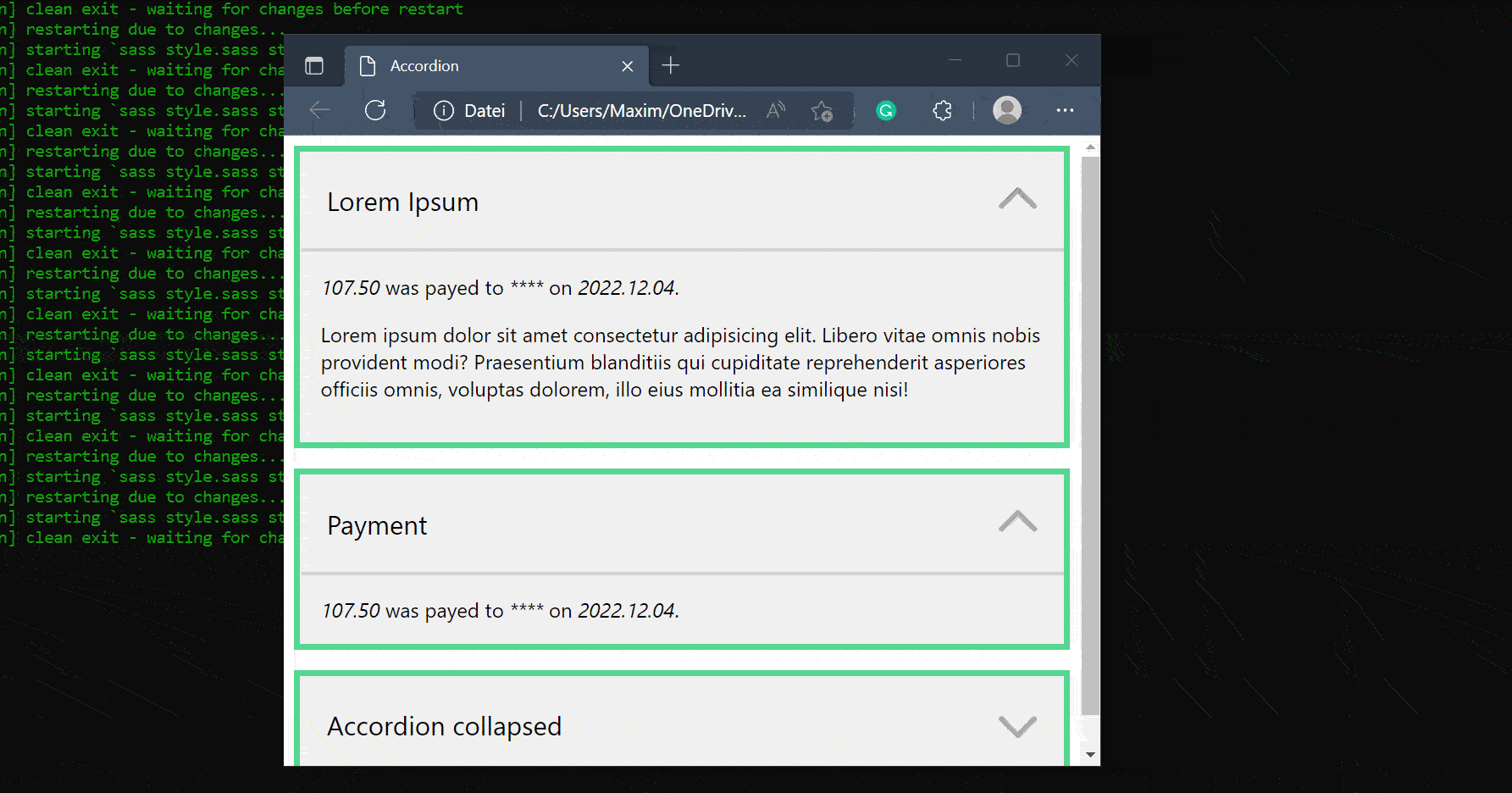
Accordion with HTML, CSS (SASS) and JavaScript.
This Tutorial will make a reusable Accordion Component with HTML, CSS (Sass), and JavaScript. We will make it, so we only have to provide a minimal HTML structure with a few classes for the accordion to work. We’ll handle most of it in JS and CSS.
So let us get right into coding.
¶HTML of the Accordion
As mentioned above, we make it so we can use the accordion anywhere. We need a div with the class accordion, with two child divs, one with the class accordion-title and one with the class accordion-body. The body is the part that will be collapsed. We can give it the collapsed Class by default, so it is collapsed by default.
<div class="accordion">
    <div class="accordion-title">Accordion Title</div>
    <div class="accordion-body collapsed">
		The body of the accordion will be collapsed.
    </div>
</div>
So that’s it for the HTML of the Accordion. You can use this anywhere in your code if you import the CSS and js correctly.
¶SASS / CSS of the Accordion
Now let us get to the styling of the accordion. Remember that this won’t work without JavaScript, but it will look nice. We do this with the preprocessor SASS, but we don’t utilize many of the features offered. I can work better with CSS if I do it via SASS, but that’s just me.
So we start by setting the font, margin, background color, and border for our accordion class.
.accordion
    font-family: 'Segoe UI', sans-serif
    margin-bottom: 1em
    background-color: RGB(240, 240, 240)
    border: 5px solid RGB(85, 214, 145)
Then we style the accordion-title by nesting it within the accordion class. We must set its display to flex and its justify-content to space-between and the align-item to center. Later we will insert an icon into the title, and we want that it is vertically centered on the text and at the end.
	.accordion-title
        padding: 1em
        font-size: 1.3em
        display: flex
        justify-content: space-between
        align-items: center
Now, if the user hovers over the title, we set different background colors and the cursor to the pointer, which is the hand. The accordion-title-icon will be inserted by js and is an SVG Path, so we can use fill to change its color.
        &:hover
            background-color: RGB(230, 230, 230)
            cursor: pointer

        .accordion-title-icon
            width: 30px
            fill:  rgb(170, 170, 170)
Last but not least, we apply a bit of styling to the accordion-body, and we say that elements with the class collapsed have the display: none.
    .accordion-body
        padding: 1em
        border-top: 3px solid RGB(210, 210, 210)

    .collapsed
        display: none
That’s it for the CSS.
¶JavaScript of the Accordion
Now let us get to the JavaScript of the accordion. We start by getting all the elements with the accordion class using the querySelectorAll function. The function will return an HTML collection, but we need an Array to loop over it, so we transform it with Array.from(obj). Then we use the forEach() function to loop over it with a function called for each iteration. We save the current object in the el variable.
/* Loop through all elements with the accordion class */
Array.from(document.querySelectorAll('.accordion')).forEach(el => {
	...
})
In the loop, we get the accordion title and accordion body divs by using the querySelector method on the object we currently have. Now the querySelector function returns the first item that matches the selector.
    /* Save important Element References */
    let accordionTitle = el.querySelector('.accordion-title');
    let accordionBody = el.querySelector('.accordion-body');
Then we replace the inner HTML of the accordion title with some more complex HTML, but we get the previous inner HTML and reinsert it but we also insert an SVG path that is a simple arrow down.
    /* Reinsert the Title with an Icon */
    accordionTitle.innerHTML = `
    <div>`+accordionTitle.innerHTML+`</div>
    <svg xmlns="http://www.w3.org/2000/svg" viewBox="0 0 448 512" class="accordion-title-icon">
        <path d="M224 416c-8.188 0-16.38-3.125-22.62-9.375l-192-192c-12.5-12.5-12.5-32.75 0-45.25s32.75-12.5 45.25 0L224 338.8l169.4-169.4c12.5-12.5 32.75-12.5 45.25 0s12.5 32.75 0 45.25l-192 192C240.4 412.9 232.2 416 224 416z"/>
    </svg>
    `
Now we also get the accordion title icon that we just inserted.
let accordionTitleIcon = el.querySelector('.accordion-title-icon');
After that, we define a function that toggles the collapsed Class for the body, and we rotate the icon dependent on the state of the body. We do this with a ternary operator.
    /* Call this function when clicking on the title */
    let toggle = function() {

        /* Use el.classList.toggle(name) to toggle the class in the Element */
        accordionBody.classList.toggle('collapsed')

        /* Set the Icon Rotation depending on whether the collapsed Class has been set. */
        accordionTitleIcon.style.transform = accordionBody.classList.contains('collapsed') ? 'rotate(0deg)' : 'rotate(180deg)'
    }
Then we connect the click event on the accordion title with the function we just made.
    /* Connect onclick event of title to our function (just the refernce to it) */
    accordionTitle.addEventListener('click', toggle);
Last but not least, we call the toggle function two times, so the icon looks in the correct direction.
    /* Call the function two times, so the arrow looks in the right direction */
    toggle();
    toggle();
¶Showcase
¶Conclusion
Excellent! You have successfully created an Accordion! See how you can add more features to this program, such as grouping them and only allowing one to be open simultaneously.
Keep in mind that I am also just a beginner, so it could be that my way of solving these problems is not the best or that I use functions or features that aren’t advised. Always ask questions and try to solve problems your way!


Leave a Reply